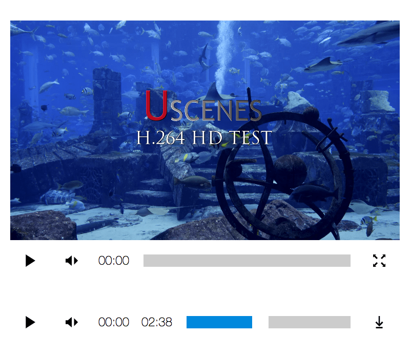
Media Player 


Media Player(link is external) is a tiny, responsive, international, accessible, cross browser,
easily customizable media player written in plain vanilla JavaScript.
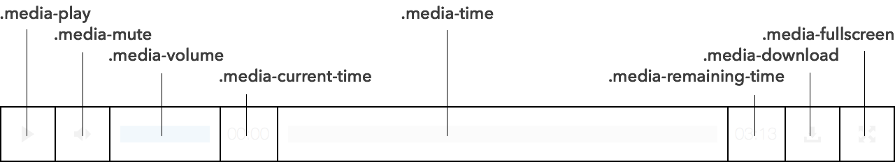
Media Player(link is external) can be controlled with any pointer or keyboard, whether it’s to
play, pause, move across the timeline, mute, unmute, adjust the volume, enter
or leave fullscreen, or download the source.
Media Player(link is external) is designed for developers who want complete visual control over
the component. It’s also for developers who want to hack at or extend the
player without any fuss. The player itself does all the heavy lifting; semantic
markup, accessibility management, language, fullscreen, text direction,
providing pointer-agnostic scrubbable timelines, and lots of other cool
sounding stuff.
Usage
Add the required JavaScript and default CSS to your page.
<script src="https://unpkg.com/mediaplayer/browser.js"></script>
<link rel="stylesheet" src="https://unpkg.com/mediaplayer/browser.css"></script>
Node Usage
npm install --save mediaplayerImport the library and create a new Media Player(link is external) using any media element:
import MediaPlayer from 'mediaplayer';

// get target from media with controls
const $target = document.querySelector('audio[controls], video[controls]');

// assign media player from target (all these options represent the defaults)
const player = new MediaPlayer(
  $target,
  {
    prefix: 'media',
    lang: {
      play: 'play',
      pause: 'pause',
      mute: 'mute',
      unmute: 'unmute',
      volume: 'volume',
      currentTime: 'current time',
      remainingTime: 'remaining time',
      enterFullscreen: 'enter fullscreen',
      leaveFullscreen: 'leave fullscreen',
      download: 'download'
    },
    svgs: {
      play: '#symbol-play',
      pause: '#symbol-pause',
      mute: '#symbol-mute',
      unmute: '#symbol-unmute',
      volume: '#symbol-volume',
      currentTime: '#symbol-currentTime',
      remainingTime: '#symbol-remainingTime',
      enterFullscreen: '#symbol-enterFullscreen',
      leaveFullscreen: '#symbol-leaveFullscreen',
      download: '#symbol-download'
    },
    timeDir: 'ltr',
    volumeDir: 'ltr'
  }
);
The prefix option is used to prefix flat class names, which are otherwise:
.media-player {}
.media-media { /* video or audio element */ }
.media-toolbar {}
.media-control.media-play {}
.media-symbol.media-play-symbol { /* play svg */ }
.media-symbol.media-pause-symbol { /* pause svg */ }
.media-control.media-mute {}
.media-symbol.media-mute-symbol { /* mute svg */ }
.media-symbol.media-unmute-symbol { /* unmute svg */ }
.media-text.media-current-time { /* plain text */ }
.media-text.media-remaining-time { /* plain text */ }
.media-slider.media-volume {}
.media-range.media-volume-range { /* full volume */ }
.media-range.media-volume-meter { /* current volume */ }
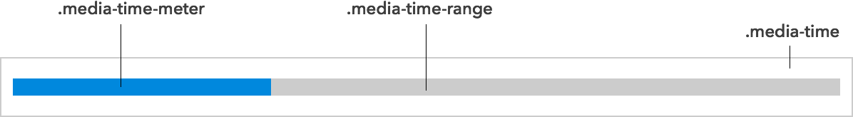
.media-slider.media-time {}
.media-range.media-time-range { /* full duration */ }
.media-range.media-time-meter { /* elapsed time */ }
.media-control.media-download {}
.media-symbol.media-download-symbol { /* download svg */ }
.media-control.media-fullscreen {}
.media-symbol.media-enterfullscreen-symbol { /* enter full screen svg */ }
.media-symbol.media-leavefullscreen-symbol { /* leave full screen svg */ }Note the convenience classes like media-control, media-symbol,
media-slider, media-range and media-range-meter. These make it easier to
style a group of controls or to add new controls.
Because flexbox is used to arrange the controls, the order property can be
used to easily rearrange them.
The lang object is used to provide accessible labels to each control in any
language. Undefined labels will use English labels.
The svgs object is used to assign SVG sprites to each control in each state.
There may be IE limitations when using external sources with your SVGs, so read
SVG use with External Source(link is external) for details and solutions.
Media Player Instance
All DOM generated by Media Player(link is external) is easily accessible from its instance.
new Media(mediaElement, options);media: the original media targettoolbar: the toolbar containing all the media controlsplay: the play buttonplaySymbol: the play imagepauseSymbol: the pause imagemute: the mute buttonmuteSymbol: the image seen before clicking muteunmuteSymbol: the image used after clicking mutecurrentTime: the current time elementcurrentTimeText: the current time text noderemainingTime: the remaining time elementremainingTimeText: the remaining time text nodetime: the time slidertimeRange: the time slider rangetimeMeter: the time slider metervolume: the volume slidervolumeRange: the volume slider rangevolumeMeter: the volume slider meterdownload: the download buttondownloadSymbol: the download imageenterFullscreenSymbol: the full screen enter imageleaveFullscreenSymbol: the full screen leave image
Sliders
Volume and time controls sliders allow you to drag volume up or down and time
backward or forward. By default, these sliders work left-to-right, meaning that
dragging the slider to the right advances the control. This behavior is
expected in a right-to-left environment as well.
These control can be configured to work in any direction — right-to-left
(rtl), top-to-bottom (ttb), bottom-to-top (btt) — with the following
configuration:
new MediaPlayer(audioElement, {
  volumeDir: 'btt', // (volume will drag bottom to top)
  timeDir: 'ttb' // (time will drag top to bottom)
});
Accessibility
Media Player(link is external) automatically assigns ARIA roles and labels to
its controls, which always reflect the present state of the media player.
Special slider roles are used for volume and time which are then given helpful
keyboard controls.
Events
Three new events are dispatched by Media Player(link is external). playchange
dispatches whenever play or pause toggles. timechange dispatches more rapidly
than timeupdate. canplaystart dispatches the first time media can play
through.
Keyboard Controls
Spacebar, Enter / Return
When focused on the play button or the timeline slider, pressing the
spacebar or enter / return toggles the playback of the media.
When focused on the mute button or the volume slider, pressing the
spacebar or enter / return toggles the muting of the media.
Arrows
When focused on the play button or the timeline slider, pressing
right arrow or up arrow moves the time forward, while pressing
left arrow or down arrow moves the time backward. Time is moved by 10
seconds, unless shift is also pressed, in which case it moves 30 seconds.
When focused on the mute button or the volume slider, pressing
right arrow or up arrow increases the volume, while pressing
left arrow or down arrow decreases the volume. Volume is moved by 1%,
unless shift is also pressed, in which case it moves 10%.
Browser compatibility
Media Player(link is external) works in all browsers supporting Audio, Video, and SVG elements.
This includes Chrome, Edge, Firefox, Internet Explorer 9+, Opera, and Safari 6+.
Older versions of Edge and Internet Explorer may need additional assistance
loading SVGs from an external URL.
Read SVG use with External Source(link is external) for details and solutions.
Demos
- Standard Experience(link is external)
- Right-To-Left Experience(link is external)
- Playlist Experience(link is external)
- Subtitled Experience(link is external)
Licensing
Media Player(link is external) and its icons use the CC0 “No Rights Reserved” license.
Media Player(link is external) adds up to 2.47 kB of JS and 582 B of CSS to your project.

 Made by ILUNION for the Prosperity4All project: Ecosystem infrastructure for smart and personalised inclusion and PROSPERITY for ALL stakeholders. This project has received funding from the European Union’s Seventh Programme for research, technological development and demonstration under grant agreement, No 610510.